Purchasing & Licensing FAQs
- What's included in the license?
- How many licenses do I need?
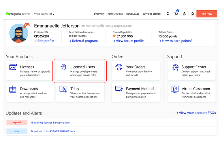
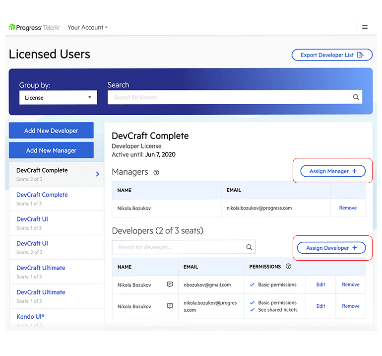
- How do I assign developers and managers to the purchased licenses?
- What is the difference between a license holder, developer and manager?
- Can I install the product on more than one machine?
- Can I use the product on more than one project/server/domain?
- Am I allowed to use the product after the one-year subscription expires?
- Why do I need to assign the licenses I purchased to the developers who will use them?
- How do I transfer a license to another user?
Licensing
Expand all
- How can I purchase a license?
- Can I purchase a license for someone else?
- Can I purchase a license through a reseller?
- How can I find my previous orders?
- Do you have a refund policy?
Purchasing
Expand all
- Do you offer discounts to educational and non-profit organizations?
- Do you offer competitive upgrades?
- Do you offer volume discounts?
- What are Telerik Points and how can I use them as a discount?
Special Pricing
Expand all
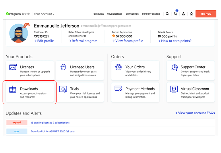
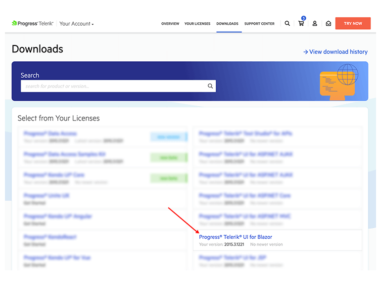
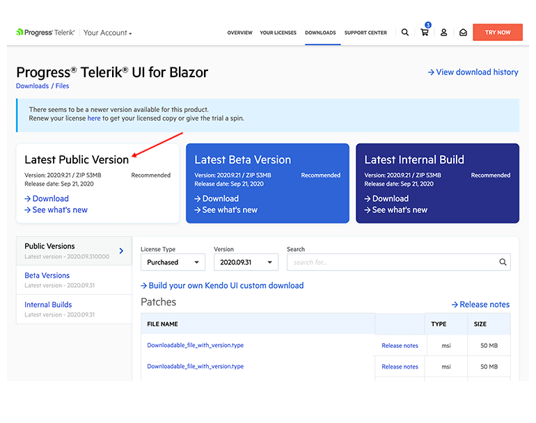
- How do I download and install the licensed product version?
- How do I install new versions of the product I bought?
- How do I access any other product files or the latest internal build?
Downloading and Installing Your Products
Expand all
- What are the benefits of renewing my license?
- How can I check my upgrade options?
- What are the benefits of upgrading my license?
- How do I renew my license?
Renewals & Upgrades
Expand all
What is the Auto-Renewal Program?
The Auto-Renewal Program allows members to pay their Telerik product license renewals directly from their credit/debit card account. The Auto-Renewal Program payment process automatically renews each year, freeing you from having to resubmit your renewal and payment information annually.
- Who can sign up for the Auto-Renewal Program?
- What are the benefits of the Auto-Renewal Program?
- How do I sign up for Auto-Renewal Program for existing licenses?
- How will I know when a payment is made or how much was paid? Will I get an invoice?
- Will the Automated Payment System remind me my card is expired?
- How do I change or update my Auto-Renewal Program contact or payment information?
- How do I reconcile any problems I may have with the Auto-Renewal Program?
- What if I don't have enough money in my account when the Auto-Renewal Program is posted to my account?
- How do I cancel Auto-Renewal?
- How long does Auto-Renewal continue?
Renewals & Upgrades
Expand all